Wednesday, December 7, 2011

Monogrammed Gift Enclosures

~Give the gift of personalized gift enclosures.~
Letterpress cards with custom calligraphic monogram and painted edging.
These beautiful cards could be designed to include a name, illustration or whatever you like as your personal logo for gift enclosures, calling cards or business cards.  The design could be a mixture of a typeface and calligraphy, a custom illustration or a motif from the fabulous fine lines offered at A Fine Line.

They make the perfect accessory to any stationery wardrobe.

monogram designed by Dana Cochran
also available in other wonderful colors, shapes and sizes

Saturday, December 3, 2011

December Promotion ~ Engraved Wedding Invitations

~Enjoy 15% off Engraved Wedding Invitations~
available with or without calligraphy
you may use a wedding font

Sunday, November 27, 2011

Invitation Suites ~ Stice

Customer review:
Thank you Dana for doing such an amazing job on our custom calligraphy invitations and envelopes. While we knew we wanted something unique, we never dreamt that our stationery would be so beautiful. Upon receiving their invitations, friends and family called just to tell us how gorgeous the entire package, both invitations and envelopes, were! One friend said she felt the invitation was so elegant that she envisioned she would be attending Cinderella's wedding. I'm not exaggerating, our invitations have been a huge conversation piece and it's all thanks to you! My parents and I could not be happier with your service throughout designing, ordering and sending out our invitations.
Thank you! Kate Stice

ps...One friend, a design friend none-the-less, said she waited to RSVP because she even loved the reply card so much that she had it, along with all the other pieces, on her fridge to admire. Her husband confirmed, "I've never seen someone stroke paper the way Anna stroked your invitations." :)

Review left on The Knot Wedding Network:
Dana at A Fine Line Studio was great to work with! She did our wedding invitation, our thank you cards and our envelopes. They turned out stunning! I even came to her with an idea for an envelope format/style she'd not tried before and she did it for us! It looked great! We received tons of compliments and it really set the tone for the wedding.
The bride asked me to address her envelopes in a layout she had seen in Martha Stewart Weddings and I agreed to try. I must give credit to Maria Thomas for the original idea of this design.

I had such fun working with this bride on her wedding invitations.  Thank you, Kate!

Photograhy by the amazing Jeremy Russell. Please go to his blog to see more photos! Thank you, Jeremy!


Monday, October 24, 2011

Invitation Suites ~ Lowrey

I love everything about this custom suite I created for a bride that was married this past weekend. 
She wanted a vintage, elegant feeling, for her invitation suite with a unique custom motif she could use throughout her wedding.
The calligraphy was engraved with a dark chocolate ink and combined with a chocolate tissue envelope liner ~ and of course, I addressed the envelopes with the same ink color and lettering style.
Since it was a Fall wedding, she asked me to design a unique, autumnal leaf which we could use starting with her save the date to her wedding programs and beyond.  She told me she was having it carved into an ice sculpture. I can't wait to get some professional photos to share ~ as well as to see myself.
I painted the leaf on the program, to coordinate with the hand-dyed ribbon I found for her, in the same shade of plum she was using at the wedding and reception.  (It really was not as pink as it looks in the photo - but more of a watercolor wash of the ribbon color.)
I loved seeing the ribbons lined up, as I packaged them, and look forward to seeing how she displayed them.
Here are her sweet comments about the process.
~I hope it was a perfect day for her and the groom. ~

I can’t say enough about Dana’s work except that I am blessed with the fact that I found her work online as I was searching vendors in Asheville one day. Chad and I both love visiting the mountains and Asheville in general, and decided early on that we wanted Asheville as our wedding destination.

Dana- as soon as I saw your work online I knew I wanted to have you as my wedding calligrapher. I knew I wanted to have an elegant and traditional wedding, but with a creative, vintage twist. I have had a hard time putting into words what I have visualized, but I can say I could not be happier with what you have done! It is actually my favorite part of the wedding so far and I think it has inspired a lot of my plans. And all the while, you have been so absolutely wonderful to work with and professional that I feel like I am your only client which I know is not the case because you are so freaking talented! Thank you for all you have done! 


Wednesday, October 12, 2011

Invitation Suites ~ Searles

This adorable bride asked me to design a contemporary invitation, with a vintage twist, based on another invitation design she had seen and liked ~ however the other style, she felt, was a bit too 'angular' and sharp for her, so here is what I came up with. I softened the capital letters and combined them with my Allegro style.  We both loved the final piece!  Here is what the bride had to say~

We LOVE them! It was like handling little perfect pieces of art. It is going to be painful to part with them! They honestly could not have turned out any better, they surpassed my expectations. They are just wonderful and I thank you one thousand times over for all the work you put into them. I wish I had sent myself 10 invitations so I could get these little beauties in the mail.
THANK YOU THANK YOU! I love the invitations, thank you for making this process so joyous for us!
Engraved in Gray Suede on Soft Ecru.
...and a close up view.
The bride later sent me this comment. The invitation really does set the tone for the entire event!
We have been getting GLOWING feedback about the invites. Everyone is just ranting about how gorgeous they are, and you can tell the invites have just upped the excitement level about the whole party 100%!  
I love to see my lettering backwards on engraving plates!
I repeated the style on seating cards, which were arranged on a mirror, and place cards that were placed on top of a gift at each place setting.
There were three long feasting tables at the reception.  Each table was divided into three sections which were named after favorite, meaningful places the couple had visited, helping each guests find their 'section' at the table.
I also designed three original menus per table.  I love the scrumptious vintage paper, which was a pale blush, combined with the soft gray calligraphy. No two pieces were alike.
Since each piece was created by hand, they are not perfectly centered ~ but that is the charm and uniqueness of handwritten pieces versus a computerized font, isn't it?
I hope to get some photos from the professional photographer to share with you in a Feature Wedding ~ but in the meantime, I hope you enjoy these I took. It was a beautiful wedding.
~~~

Wednesday, October 5, 2011

Book Love: Seasons


I buy and read cookbooks like others do novels and I am especially a sucker for ones filled with beautiful, artistic photography ~ so when I came across Seasons by Donna Hay, it was a must have for my collection.

I love to bake and cook with the Seasons and always try to eat foods that are plentiful within a particular season, buying locally when I can. This book is divided by the season, my favorite being Autumn. 
 
The photos are works of art, but so are the recipes ~ simple and delicious.  The recipe for Plum and Chocolate Clafoutis is the best I have ever had and very easy to make.
It is one cookbook, in my collection, that I will most definitely be returning to again and again ~ not only to admire, but to actually use.
...and even if you don't like to bake or cook, it looks great on display!

book cover photo ~ amazon
all other photos ~ Dana Cochran

Thursday, September 29, 2011

Birth Announcement

One of my former brides asked me to create a sweet birth announcement for her baby girl.
Engraved in Blossom with a darling dragonfly motif at the top and envelopes lined with a pink tissue ~ they are precious. 
...and I think she loved them too.

DANA!!!!!!!!!!!!!! oh my goodness, i am FREAKING OUT over the announcements! they are so beautiful! i could not love them more. thank you so very much for creating the most elegant, perfect announcement for my baby girl. i am so excited!!!

my sincerest appreciation,
blair

Wednesday, August 10, 2011

Invitation Suites ~ Felts

This invitation suite was designed using my flourished Spencerian script. I created it a few years ago for a bride who wanted a very elaborate and intricate invitation.  It was later submitted to a magazine and my engraver was kind enough to engrave in in several colors.  I am posting only a few.  They were all so gorgeous, but the French Blue, Copper and Sweet Pea were my favorites.  Other yummy choices were Pink Petal, Wisteria and Chocolate.
  

Wednesday, July 27, 2011

Asheville Watercolor Map


I had such a great time creating this map for one of my favorite couples! 
Well not at first! ...I have to say, when I started this piece, I offered the bride her money back as I just did not feel my sketches were up to my standards. I had never drawn a map and couldn't create the look I was going for.  Here was her response, which cheered me on.~

"Oh Dana, I just love it!  I am trying hard to see the flaws and be critical and constructive -  but I honestly got little goosebumps and teary eyed I love it so much!  I really think it’s wonderful. I showed it to my mom and she was asking when we get it because she wants to show it off to everyone!  Hopefully this gives you a bit of a boost! I am honestly just so excited to have this hand-crafted piece of artwork representing the town I love and by an artist I admire – even better it represents a time in my life that is so special! I LOVE it! I just can’t wait to share it with everyone! So I thank you again for your honesty and your integrity, I just respect you so much for the hard work you put into what I know is a job that can be thankless and difficult at times! I can’t wait to frame the map and put it in on the wall in our first home as newlyweds (which we started to move into today, how fitting!). So thanks again, I am VERY happy and so excited. You don’t even know, all this special attention has just made it even more special and beautiful – so thank you for making that happen. YAY!"

So that did give me the boost I needed and I felt if she liked my sketches, she would like the final piece - and she did!

"We are just in love with the map, we’ve been showing them off and everyone loves loves loves it!  We loved working with you, too, it was such a special process. And thank you for making all of this happen, and for making it feel like such a wonderful collaborative process! It is rare you get to work with a true artist, and I feel so lucky to get to do it for one of the most special events of my life! So thank you!"

I am so happy I continued to work on it, as it turned out to be one of the most fun projects I have done. I loved adding in little, fun details that were meaningful to this adorable couple. Now I feel ready, and eager, to create more! The maps (or just a collage of favorite places) would make great house warming, wedding or holiday gifts or really a gift or keepsake for any occasion or time of life as you can make each as unique as you like.  They also make great Save the Date cards. My husband now wants me to create one for us!

I cannot wait to share their wedding photos with you. I loved the invitation I designed for the couple, as well as their reception pieces. It truly was one of the most fun weddings I have been a part of!  As soon as I get the professional photographs, I will share ~ or I may share a few I took as a sneak peek soon. :)

Tuesday, June 7, 2011

FĂȘte with Fabric ~ Martha Stewart Weddings Summer Issue

I was so excited when Martha Stewart Weddings asked me to calligraph seating cards for their Summer 2011 issue.
 This is a page from the magazine, showing a portion of the cards.
I love doing this fun script!
Or you can go here to see more...
 ...and if you look really, really closely, you can see the dessert signs I made.

~Bonne FĂȘte~
*(I think that can translate to Happy Celebration, Happy Birthday or Happy 4th of July, so whichever ~ have a Fun, Festive week)*

Tuesday, May 24, 2011

Your Presence is Key ~ no. 2

For brides not wanting to add an actual key to this save the date style ~ a hand-painted, illustrated key is the key.

The formal invitation and reception pieces from this wedding coming soon...

Also, I will be posting my J and K - from my alphabet project - together in a few weeks.  For now ~ little time for painting and posting as I am penciling, penning, planting, pruning and pulling. 'Tis the season for spring weddings, time spent working in my gardens and not enough hours in the day!
~~

Saturday, April 9, 2011

Featured Wedding ~ Emily & John

What an adorable, sweet couple Emily and John are!  I had the great pleasure of working with Emily and her mother last year.  As I said in the "Sneak Peek", the couple were both students at Wake Forest but did not meet until they studied abroad, some years later, in Sicily.
After leaving Sicily, John wrote to Emily in his journal every day for a month and later sent this journal to her.  He also sent her a journal on their wedding day, as well as a watercolor of the breathtaking Mediterranean view they had as students in Erice, Sicily.  How romantic is that?
I love Emily's dress, which was designed by Monique Lhullier.  The tulle skirt is detachable, making it appear that she wore an entirely different dress at the reception.  So gorgeous!
Rings by Tiffany & Co.
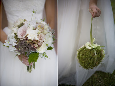
Breathtaking bouquets by The Bloom Room

John and Emily were married at the Basilica of St. Lawrence.The Catholic church has the largest freestanding elliptical dome in North America.  The stunning stained glass windows were made in Munich, Germany.
Wedding programs by me ~ A Fine Line Studio
Asheville Historic Trolley transported the wedding party from the Basilica to the Biltmore Forest Country Club for the reception.
With Sicily being so dear to the couple, each table was named after different regions they visited in Sicily, which I calligraphed onto each hand-painted table number I created.  I also calligraphed guests names on tiny cards, which were tied to little vases or pinned to pears. I also designed the couple's married monogram and used it at the top of each menu.
Tara Jordan, the amazing event designer with Wedding with Tara, sprinkled more touches of Sicily throughout the wedding reception with an assortment of gelato, served along with the wedding cake...
...and Limoncellos given as favors.
Emily dancing with her dad as her sweet mother watches on.  I have to say, Emily's mother is truly one of the sweetest mothers I have ever, ever worked with!  She was so appreciate and complimentary of everything I did for them. I have the kindest notes from her, which I saved and will always treasure.
I love what Emily's mother told me - she said they were "thrilled Emily and John found one another and this is coming from her parents who married later in life and told Emily she could not even date until she was 30!"
The couple honeymooned in the Turks and Caicos and now live in an old candy factory, converted to loft apartments where she is working on her Ph.D. in psychology (she is also a ballet dancer) and he is in law school.
I have no doubt, they will live happily ever after!
I hope you have enjoyed this spectacular photography by Abigail Seymour. Click on each image to better see her work.  I really had a difficult time narrowing my choices to only these!

~Have a beautiful weekend.~