Tuesday, December 24, 2013

Merry Christmas

With Facebook, Pinterest, Instragram, etc...I find it difficult to also Blog! 
If anyone is still following, I wish you a Merry Christmas ~ all things Merry and Bright and a New Year full of Comfort and Joy.
 

Tuesday, April 23, 2013

Invitation Suite ~ Klein

Spencerian script engraved in crisp navy on white.
Engraved stationery, spring green, navy with white and tulips ~  just a few of my favorite things.


Sunday, April 14, 2013

Invitation Suite ~ Hakeem

This week was the wedding anniversary of a very sweet bride I had the privilege to work with a few years ago, so I thought this would be the perfect time to post her invitation, as I never like to post them before the guests, themselves, receive them...therefore, I find myself posting them a year or more later!
Also, she wrote me the sweetest note I want to share.  Even when we love the work we do, kind and appreciative words, from a client, are truly priceless. ~
 
Dear Dana,

Thank you so much for creating our beautiful wedding invitations!  Your meticulous and artistic work was the perfect introduction to our wedding weekend.  While researching photographers for our wedding, I kept coming across your work on their websites.  I was so intrigued that I started looking at your website and knew I wanted you to create our special invitations.  From the start, I knew I wanted them to be unique.  A childhood friend created the artwork for the invitation and we wanted "non-traditional" wording.  You made my vision come to life!!  The beautiful Italian paper with deckled edges was perfect!  Coupled with your flourishes in eggplant ink, our invitations are a piece of artwork!  In fact, I had our invitation framed along with my bouquet, and it is displayed prominently over our fireplace!

Thank you for your patience to make everything perfect!!  I wanted the beautiful "loopy" letters and you came through!  You were so responsive to my emails and made sure that you were creating exactly what I was thinking!  When our invitations arrived in the big beautiful box, I could hardly catch my breath!  I teared up immediately and KNEW that everyone would love our invitations!  I can't imagine any other way that I wanted to announce our wedding than with your artwork!!

Sincerely,
Lori Oxley

Thursday, March 14, 2013

Invitation Suites ~ Pollard

Maybe a part of me is a little "Emily Post old fashioned" but not many wedding invitation suites are more elegant than classic, hand-written Spencerian script, engraved in black ink on 100% cotton ecru paper, with the family crest.
As much as I love tradition with a twist, some things just never go out of style.

Tuesday, January 22, 2013

Happy New Year Postcard

~Happy New Year! ~....a few weeks late. :)
 
Anyway, I had fun designing this postcard for the Biltmore Estate's wedding department to send out for the New Year.  It is one of the most gorgeous places to get married. Visit them at www.biltmore.com/weddings
 
Now if we would only get the beautiful snow.
 
Letterpress printed, in white, on heavy kraft paper by Real Card Studio.


Monday, December 24, 2012

 
Merry Christmas!

Sunday, November 4, 2012

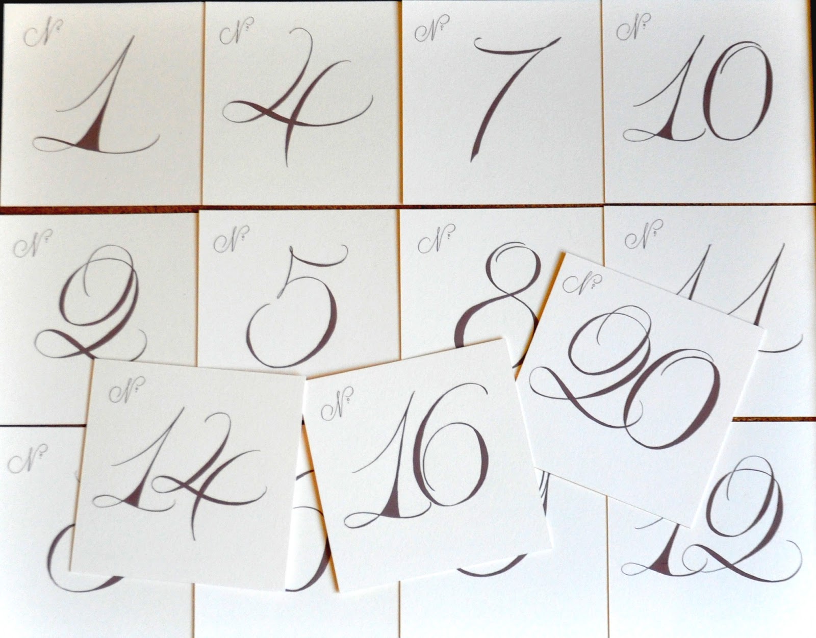
Hand-Painted Table Numbers

A sneak peek at some hand-painted table numbers I created for a wedding a few weeks ago.
I can't wait to get the photographers professional photos of this wedding, showing some other fun things I designed for this special day.
 

Tuesday, September 18, 2012

JFA monogram

I realize, as I begin working on another monogram design, that I have created so many, but have not had time to post. As you can see, I have been pulling out a few of these over the past few months.
Here is a simple copperplate monogram engraved in fawn ink on cotton paper.
Part of the fun in constructing a monogram is sketching out different letters to see which work best in the overall composition. On this one, I arranged the top and bottom loops of the F to reach out into the letters on each side.
We used the monogram on note cards, favor boxes and other pieces for the reception.

I will have share a "behind the scenes of creating a monogram" in an upcoming post. I have had people ask me if I could not just sit down and write out their letters.  No! :) It involves lots of sketches and a variety of letterforms to see which will work best. Each monogram will be shaped differently, depending on the letters involved, to form a cohesive design.

Sunday, September 16, 2012

Masters of Fashion Illustration

Masters of Fashion Illustration is one of the many fashion illustration books I own and adore. It is written by my favorite fashion illustrator David Dowton, who is one of the world's leading fashion artists.  He is best know for his drawings of Paris couture and elegant portraits of some of the world's most beautiful women.
The forward is written by one of them, Carmen Dell'Orefice (illustration by David Dowton.)  This is my favorite illustration in the book for its composition, style and colors! I also love his confident calligraphic lines.
 The book also features the best of the best, such as Erté, Andy Warhol, René Bouché, Antonio Lopez, and many more including book cover by the late Tony Viramontes.

It is a must have for anyone loving fashion illustration!

Monday, August 27, 2012

Whimsical Monograms

This is a fun, whimsical monogram I created for a client to use for her program booklets and stationery note cards.  I had one of my favorite books, The Perfectly Imperfect Home - illustrated by one of my favorite illustrators - Virgina Johnson, lying on my table and happened to notice the end pages were the same color. I love these designs together!
~ but I also like the design combined with a classical blue pattern~


...so, whatever your style, you can always incorporate a fun monogram into your stationery wardrobe!

Thursday, July 19, 2012

olivia's monogram

As I have said before, I love creating monograms ~ and here is the monogram I designed to coordinate with Olivia's note cards (in post below).
Engraved in Pink Punch

Thursday, July 12, 2012

note cards: olivia

  I have been completely obsessed with orange and navy this year ~ from stationery and clothing to the flowers I have planted and purchased.
A former bride/client commissioned me to calligraph her daughter's name for her personal stationery.  I had them engraved in a tangy tangerine that would be fun and perky for a little girl to use for many years to come .
Last week I received several new samples of letterpress patterns from Smock, a stationery line I carry and I'm seriously smitten with!  When I was photographing the note cards, the Smock cards were on the same table and I immediately knew they would make a snappy backdrop for these note cards.
Also, the same day, a friend sent a note to me (the orange paisley card) so I had to throw it into the mix too ... as well as an orange zinnia from my garden.

I will be posting more of these eye-popping patterns and note cards this month.
~~~

added note ~ it is really difficult to see that the pieces are engraved or letterpress without clicking on the images at about 200%.  is this a 'blogger' issue?

Friday, July 6, 2012

Sweet Paul ~

If you are not already familiar with Sweet Paul magazine, you really must go over and take a peek at his online version.  I may be one of the few that prefers to hold a magazine or book in my hands, rather than reading online, so I take the printed version of this gorgeous magazine and flip through the dreamy pages at my leisure. The magazine is based on Paul Lowe's hugely successful blog by the same name.
His motto is "chasing the sweet things in life".  Sweet Paul is filled with amazing photography, fabulous recipes, lifestyle goodness, creative ideas and all things that make everyday things beautiful.
Each page bursts with the colors, tastes and fragrance of summer.
I particularly love this article, styled and photographed by the amazing Dietlind Wolf, an incredibly talented propstylist, photographer and illustrator.

I adore this inspiring magazine and this issue did not disappoint.
photos by the ginger parasol

Saturday, June 2, 2012

June 2, 1962

My parents were married on June 2, 1962.  In 1978 my family was in tragic car accident, taking my father's life at the young age of 43.  Today they would have celebrated their 50th wedding anniversary. 
Their wedding invitation and note cards were engraved in English script. Looking at their invitation, I wondered why the year was not noted, but saw that Princess Grace nor Jacqueline Kennedy had the year of their wedding engraved on their invitations ... so I looked into it and saw that the year is surprisingly not essential.
...but I found it was included on the cocktail napkin from their reception.

 I wanted to take time today to remember what would have been another special moment in my parent's lives.

Friday, April 27, 2012

Mr. & Mrs.

I love making these oversized seating cards for the bride and groom's chairs at the dinner reception.


It is also fun to have large, hanging seating cards for each guest, as well as the bride and groom.

~~~
photography by Angela Stott and Jeremy Russell

Wednesday, April 4, 2012

A Fine Line featured in Martha Stewart Real Weddings ~ Special Issue!

I was beyond excited to see a custom monogram I designed featured in Martha Stewart Real Weddings ~ Special Issue! 
I love designing monograms. They are like solving fascinating little puzzles, never quite sure how they will emerge.  It was fun intertwining the Y and M and weaving them into the R for ~ YRM.
So, here is a charming way to show off your monogram at your next soirée .
~~~

Wednesday, January 25, 2012

Invitation Suites ~ Piazza

This is an invitation suite I designed a while back, and like many, have not had time to post.  The true colors are more like the photo below ~ with my lettering engraved in a beautiful café au lait ink.
I love the way the colors repeat themselves in her luscious wedding sash. Isn't it gorgeous!
I will be showing more from this elegant wedding in a featured wedding coming soon.
~~~

last two photos by LaCour

Wednesday, December 7, 2011

Monogrammed Gift Enclosures

~Give the gift of personalized gift enclosures.~
Letterpress cards with custom calligraphic monogram and painted edging.
These beautiful cards could be designed to include a name, illustration or whatever you like as your personal logo for gift enclosures, calling cards or business cards.  The design could be a mixture of a typeface and calligraphy, a custom illustration or a motif from the fabulous fine lines offered at A Fine Line.

They make the perfect accessory to any stationery wardrobe.

monogram designed by Dana Cochran
also available in other wonderful colors, shapes and sizes

Saturday, December 3, 2011

December Promotion ~ Engraved Wedding Invitations

~Enjoy 15% off Engraved Wedding Invitations~
available with or without calligraphy
you may use a wedding font

Sunday, November 27, 2011

Invitation Suites ~ Stice

Customer review:
Thank you Dana for doing such an amazing job on our custom calligraphy invitations and envelopes. While we knew we wanted something unique, we never dreamt that our stationery would be so beautiful. Upon receiving their invitations, friends and family called just to tell us how gorgeous the entire package, both invitations and envelopes, were! One friend said she felt the invitation was so elegant that she envisioned she would be attending Cinderella's wedding. I'm not exaggerating, our invitations have been a huge conversation piece and it's all thanks to you! My parents and I could not be happier with your service throughout designing, ordering and sending out our invitations.
Thank you! Kate Stice

ps...One friend, a design friend none-the-less, said she waited to RSVP because she even loved the reply card so much that she had it, along with all the other pieces, on her fridge to admire. Her husband confirmed, "I've never seen someone stroke paper the way Anna stroked your invitations." :)

Review left on The Knot Wedding Network:
Dana at A Fine Line Studio was great to work with! She did our wedding invitation, our thank you cards and our envelopes. They turned out stunning! I even came to her with an idea for an envelope format/style she'd not tried before and she did it for us! It looked great! We received tons of compliments and it really set the tone for the wedding.
The bride asked me to address her envelopes in a layout she had seen in Martha Stewart Weddings and I agreed to try. I must give credit to Maria Thomas for the original idea of this design.

I had such fun working with this bride on her wedding invitations.  Thank you, Kate!

Photograhy by the amazing Jeremy Russell. Please go to his blog to see more photos! Thank you, Jeremy!