Friday, December 24, 2010

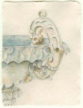
~Merry Christmas~

Wishing you all things Merry and Bright
... with a little sparkle too!
***

photo The Ginger Parasol

Thursday, December 9, 2010

Invitation Suite ~ A-Z

This is an older invitation suite that is still a favorite and a style that will never be dated.  It incorporates all the rich things I love ~ handmade paper, double-sided velvet ribbon, my favorite colors (green and white), engraving, embossing and some hand-lettering ... although I would have preferred it be all calligraphed.  There are so many fonts that now look very similar to calligraphy and handwriting, but as this client discovered, there are some things a font and computer cannot do - for example, create an intricate monogram.  So I took the first letters of the bride and groom's name to created a monogram and included a custom illustration.  We used this on everything from the save the dates to the programs.  ...and of course, I calligraphed the envelopes to match the font since it is a no-no to address your formal invitations with a computer/font ~ so as I see it, handwriting is never out-of-fashion, but always in style.
~~Have a beautiful week!~~

Monday, November 15, 2010

Something New


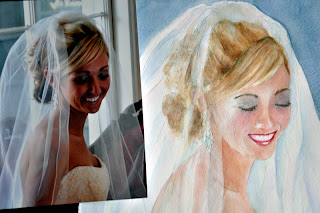
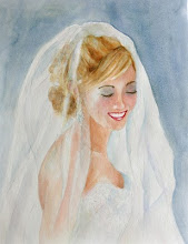
This is a sneak peek of something new I may be offering to my clients in the future.  It is my very first "portrait" ~ I say that loosely, as I am still refining.  It is also a sneak peek of her wedding, which I will be posting in the months to come.  This will be a gift to the bride.  She was so precious to work with ~ truly a dream client! and I am most grateful she is allowing me to "practice" on her as I develop my technique (I have another of her in the works). It originally started out that I was going to do a loose sketch of her gown...then I attended a watercolor class on portraits...

When I took my first watercolor portrait class from Janet Rogers a few months ago, I never dreamed how much I would enjoy it.  I painted this bridal portrait, when I returned home, with Janet's encouragement, after showing her some of the sketches I had done of the bride and the gown.  Janet is one of the most amazing and inspiring teachers I have ever had!!  I highly recommend her. I originally signed up for the class because it was florals and portraits, and I was really only interested in the floral portion ...until we got started ~ now I love faces.  I was most afraid to paint the eyes, as there is so much of the personality there, so I started with the eyes looking down on this one, but now I love painting eyes!  My goal is for my next portrait to be a lot looser and livelier.

So, more to come on this later, as well as some exciting classes I have signed up for next year.


Friday, October 29, 2010

Spooky Couture

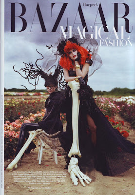
The dark, whimsical charisma of Tim Burton is captured by photograher, Tim Walker in this quirky photo shoot for last year's October issue of Harper's Bazaar ~ Magical Fashion. "In anticipation of his retrospective at New York's Museum of Modern Art, filmmaker Tim Burton reimagines the season's dark delight." Harper's Bazaar

Tim Walker is my all time favorite fashion photographer. He creates magic, combining the conventional with the adsurd.  His photography is among the most imaginative that I have ever seen.  He has inspired many of my shop's store front windows ~ only dreaming I could create his lavish sense of style.

I thought it would be fun to show the collaboration of the these two brilliant and creative minds again this weekend ~ as every day is probably like Halloween for these artists.
 
~~Have a magical, fashionable Halloween~~

Friday, October 15, 2010

Silhouette Seating Chart

Last year I was asked to create a seating chart for a bride that would incorporate the couples' silhouette and the feathery theme she was using throughout her wedding. The bride did wear feathers in her headpiece, but I saw no parrots flitting around the groom. 
It was one of the most unique weddings I have ever been asked to work on.

I started with the draft above, using the photo the bride sent to me below.
The bride is an artist and was a student at Parson's School of Design at the time we were working on this and had a very strong idea of what she wanted, so I was ecstatic when my sketch was approved! It is so hard working for another artist; trying to imagine what they visualize ~ but this bride was fantastic!

...and voilĂ  ~ here is the final piece.

It was such a fun and lively wedding! As soon as I receive some of her wedding photos, I will do a featured wedding and tell you all about it, post her invitation suite ~ which was one of my all time favorites and show you the large, oversized menu I designed.

Wednesday, September 22, 2010

Invitation Suites ~ Brier and McDonald

On this first day of Fall, I thought it would be the perfect time to share two invitation suites I created for autumn weddings. Normally, I do not like to do the same, identical design twice but one bride wanted the same flourish and motif I had designed before ~ so I did. She asked that her leaves include more reds ~ so there is a slight variation ...and of course, the words are always different! So, I guess it really is not exactly the same design!
They are both printed in chocolate, on Italian paper, and individually hand-painted.
~~Have a lovely, fall day!~~

Monday, August 30, 2010

Meet Lucy Lambchop

 
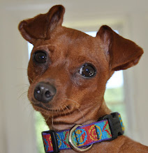
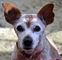
Introducing our newest little family member ~ Miss Lucy Lambchop
It is an amazing story of serendipity and how Lucy found her way to us.
We had been considering purchasing two Miniature Pinschers from a breeder who shows her dogs at Westminster Dog Show.  She had two that were not quite show quality, and we didn't care, we just wanted to love them.  We were about to call to let her we would take them, when Gigi's oncologist called to say that she had rescued a Miniature Pinscher and wanted to see if we would like to adopt her - knowing how much we loved Gigi and missed her.  We went to see Lucy (who they were calling Pixie and we had even considered that name for one of the new puppies - another coincidence!) and knew she was ours from the minute we saw her.  It seems that we are meant to rescue these little Min Pins (a two hundred year old breed - a cross between a Dachshund and an Italian greyhound - not a Doberman as some people call them), that often find themselves in shelters. We had rescued Gigi, as well. They are very hyper little dogs, with a very unusual and unique personality that does not suit all.  They are very protective and territorial and are usually a one to two person dog - very curious, playful and comical.
Lucy has made herself very much at home, in the same spot Gigi liked best - on the fluffy sofa, that desperately needs replacing, in our sunroom. She loves to sunbathe with her blanket.  It took her a few days to trust us, but she is now totally Queen Bee of the house.
We feel so fortunate to have her and feel that Gigi had a hand in Lucy becoming ours.  She has helped fill the huge hole that Gigi's passing left in our hearts.  They are so much alike it is really eerie. 
We are head over hills in love with her. 
Looks like another little angel has found us!

Monday, August 2, 2010

Invitation Suites ~ Snipes


I had so much fun creating this invitation suite. 
The bride was using eggplant and mossy greens throughout her wedding and asked me to incorporate these colors into her wedding invitation suite.
It was printed in eggplant on gorgeous Italian paper.

It is difficult to see the true colors of this suite, as I am having some camera issues, but the eggplant ink is truly beautiful. I mixed an ink to address in the same color.
The bride also asked me to illustrate an antique hydrangea for the formal invitation.
After it was printed, I hand-painted each flower.  No two were alike ~ ranging from various shades of purple to dark eggplant.

~Have a lovely week ~

Saturday, June 26, 2010

Real Wedding Weekend: Dianne & Peter


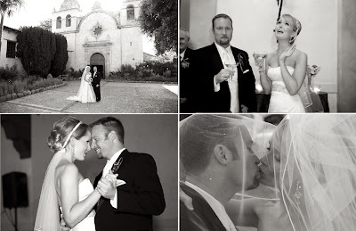
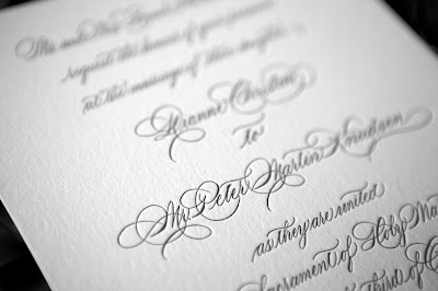
This is my last post about this fabulous wedding I had the privilege to be a part of.  Dianne and Pete's photographer, Mike Steelman, so generously shared these gorgeous photos with me, how can I NOT share them all with you ... well there were actually more, but I chose some of my favorites ~ love the one above of the happy bride! Mike really is one of the kindest photographers I have ever worked with. He even took the invitation suite I designed and shot it in various locations for me. I loved them all, as you can see, since I included them in my last three posts!  I especially like these with the misson in the background.
Thank you, Mike!!!


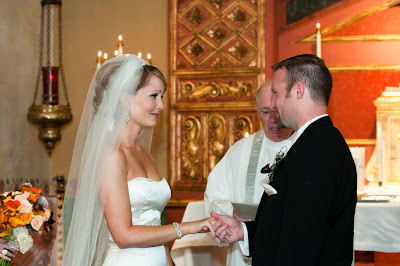
Dianne and Pete chose to have a destination wedding in beautiful Monterey, California. They wanted a small intimate wedding of only 65 of their closest friends and family members and thought this would be the perfect location. Their ceremony was held at this historic Carmel Mission in Carmel. Dianne's cousin was married in the Basilica the year before and Dianne has visited the mission during family trips since she was a little girl.
 

Dianne’s wedding gown was designed by Lazaro. She met him the day she picked up her gown. After taking pictures with the designer, Lazaro drew a sketch of her gown as a special wedding keepsake.


 ~so sweet! 

The Knudsens wedding reception was held at Monterey Peninsula Country Club on Pebble Beach. Dianne and Pete knew the picturesque surroundings would create a fairytale setting for their friends and family to enjoy and remember.
 

The couple took eight family members and friends with them on a portion of their honeymoon in Napa Valley. After a few days touring through wine country they took off by themselves to San Fransisco, Big Sur, and back to Carmel.

I have no doubt these two love birds walked off into the sunset...
 

...and will live happily ever after.
~xoxo~
 
invitations and programs ~ a fine line
photography ~ mike steelman

Tuesday, June 22, 2010

Invitation Suites ~ Derby


Dianne, the bride I created this suite for, is one of the most appreciative clients I have ever had the pleasure of working with ~ a beautiful person inside and out.  Working with clients like her makes me realize why I love, love, love what I do and do what I love!!!


I want to share with you accolades from Dianne :)

“From the moment I first saw Dana Cochran’s work I knew I had to have her design my wedding invitation. Dana answered endless e-mails into the late evening hours and constantly consulted me through her design process. Her attentiveness, professionalism, and impeccable taste helped to create the invitation suite of my dreams. When I finally saw my invitation and the lettering on my envelopes I was in tears. It was exquisite. It made such an elegant statement to my family and friends before their arrival in Carmel, California for my wedding. I still receive compliments about it and no one can believe it is actually her handwriting. My matron of honor had my invitation custom framed for me since she knows how much I love it. Now everyone who visits my home will get to see Dana’s fine work.

Dana is the perfect pick for a bride with elegant taste and an appreciation for beautiful writing. I am so pleased she was part of my special day.”

Dianne Derby Knudsen 

I will share photos from this wedding this weekend~~

invitations ~ a fine line
photography ~ mike steelman

Sunday, June 20, 2010

Sneak Peek: Dianne and Pete


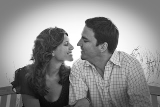
Stop by next weekend to see more of this gorgeous couple in a Real Wedding Weekend I have to show you.  Can't you just see the passion between these two?!!  
Love their engagement photos.
One of my all time favorites!!


It was such a surprise when this bride contacted me to create her wedding stationery. Just a month or so prior, I had seen her on a news broadcast, from another state (as we pick up this particular television station) and had commented to my husband how cute I thought her haircut was.  Later that week I told my hair stylist I wanted her to see this news anchor's haircut and see what she thought about it. Imagine the surprise I felt when a few months later this bride contacts me!!!!  What a small world we live in.
invitations ~ a fine line
photography ~ mike steelman

Monday, June 7, 2010

~Basking in the Spotlight~

I am basking in the spotlight today ~ and blushing a little, too.  Dearest Sweet Janet, over at French Blue wrote an entire post all about me!!!  Janet really does make everything so much more exquisite, as does her amazing daughter Noel.
If you don't already know them, you really must drop by to meet this dynamic mother/daughter duo!!
Janet and Noel are two sweet drops in my puddle of inspiration.
Please skip on over French Blue to see this dear post! :)
Thank you, Janet!!!
~xoxo~
image 1 ~ Tim Walker
image 2 ~ French Blue


Thursday, June 3, 2010

Invitation Suites ~ Stewart

This is an invitation suite and monogram I created for the sweetest bride.  It is my version of "Spencerplate" ~ combining Spencerian script with Copperplate.

I have photos of this wedding that I will post soon in a Featured Wedding.

Monday, May 24, 2010

Invitation Suites ~ Portwood


I have had several requests from clients to post some of the invitation suites I have designed ... since my website is in major need of updating, I suppose. :)  I am currently working on two suites that I can't wait to show you. They are hand-lettered and each have hand-painted watercolor flowers.  Since the brides have not even seen them, I will have to wait until they are finished and sent to their guests. I am going to start by posting some of my favorites from past weddings in a series called Invitation Suites, which I will post a few times each month.  A bride can then refer to the suite by name.

This is a suite I really loved from last summer ~ and one of my favorite scripts to do.  My calligraphy is engraved, in charcoal, on a beautiful Belgian paper and the envelopes lined in a soft, celery green.  The suite set the tone for a lovely summer wedding.

We also carry lots of others fabulous designs, through stationery lines we offer, at A Fine Line ~ both letterpress and engraved, calligraphed and not ~ all very unique and customized.

Invitations and Calligraphy ~ A Fine Line


Saturday, April 24, 2010

~ April in Paris ~

I wish I could say I was spending the month of April in Paris, but instead I have been busy creating a logo design and illustrations for April in Paris ~ a French Patisserie in Texas.

I met April about five years ago at two separate, week long, calligraphy workshops.  April was there to create a logo for her European bakery and espresso bar.  We had so much fun sharing and getting to know each other.  I lost touch with April soon after and was delighted to hear from her again. During this time she had decided she wanted more and left for NYC and then to Paris for more culinary studies.

While studying in Paris at the Ritz Escoffier and Le Cordon Bleu, her experience inspired her to start a new venture and open April in Paris.

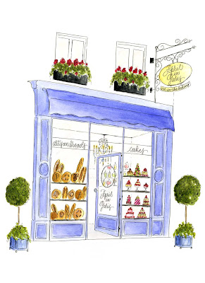
When she contacted me she told me she loved the work I did at the workshop and wanted me to create a logo and some whimsical illustrations for her new bakery and website (not up yet).  She asked me to use the beautiful storefronts and patisserie of Paris, the colors of French macaroons, artisan breads, French silver and fresh ingredients for inspiration.  With those things in mind, and uncertain of exactly what she wanted, I started sketching away.

Here are a few of the illustrations I created for April's website and printed pieces.
artisian breads and pastries
I felt the first pedestal was too dark ~ so I did another ~ but liked the bread in the first one best.  Basically...pretty similar...
...and because I tend to redo things, that most people do not notice (those I have worked for will know this! :), I also drew another storefront, using my first outline. I felt the painting could be better...but in the end, I couldn't tell it was much different either. So, I now have one for my portfolio!
Pâtisserie Stohrer is a favorite of April's and was my inspiration for her storefront illustration.
fresh ingredients
 a macaroon pedestal
mini cupcakes on silver cherub stand
silver serving pieces
a few petits fours ... that didn't scan well

When I showed April several ideas I had for her logo design, her response was so funny, like that only of a baker - "I cannot possibly choose one. It is like looking into a freshly filled pasty case - you have to have a bit of everything!"  So I decided to go with a wheat wreath, encircling the logo, to represent the French artisan breads and pastries she loves to bake.  We then had her business cards engraved in gold on chocolate European paper. She loved that it was like a classic bittersweet chocolate macaroon with a touch of edible gold leaf or classic French gold gilt. Eventually, she wants her business cards to run the full spectrum of macaroon colors "just as the competition for the most exotic colors and flavors continue to unfurl in Paris...with gold gilt engraving, of course."  The first card she chose to use represents her love for the simple chocolate macaroon with a bittersweet chocolate ganache filling.
Creating a "look" for April in Paris was so much fun.  A happy client is the sweetest reward of all! 

From April~
Dana,
I knew you were the one I wanted to do this for me!!
Your illustrations are absolutely poetry in watercolor. I came to you wanting something specific and left with so much more since I entrusted you with so much artistic freedom. Little details I was not sure really came through with my description - you totally brought through.
I couldn't be more happy, unless I were sitting in a bakery on Rue St. Honore having a macaroon!
I cannot quit staring at it all. I am so excited. It is so much beyond what I was thinking. I just absolutely love everything!!!
Merci-
April